- General
-
 Idéer
Idéer

+2
Planlagt
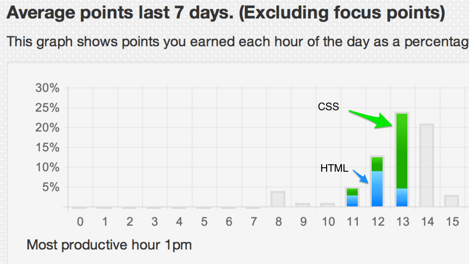
Dashboard Pie Charts - Color blocks for language %
Represent percentage of language by breaking each day/hour pie chart value into colors that correlate with a text-color on right column
Svar

Svar
Planlagt
Hi Mat,
Thanks for the suggestion, the current graph package doesn't support this but I am planning on rewriting the graphs maybe in D3 and I will implement it then.
Cheers,
Paul
Kundesupport af UserEcho


Hi Mat,
Thanks for the suggestion, the current graph package doesn't support this but I am planning on rewriting the graphs maybe in D3 and I will implement it then.
Cheers,
Paul